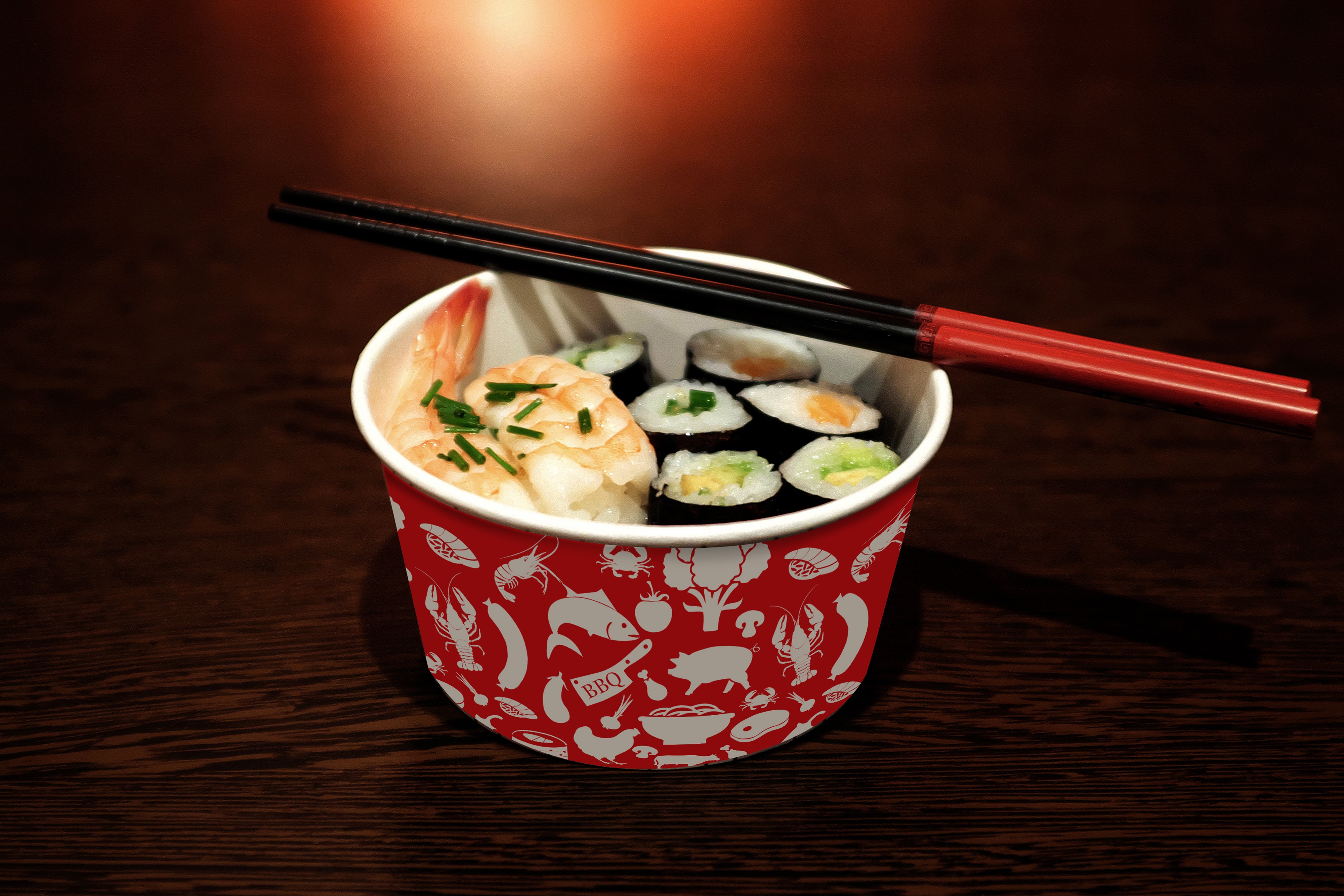
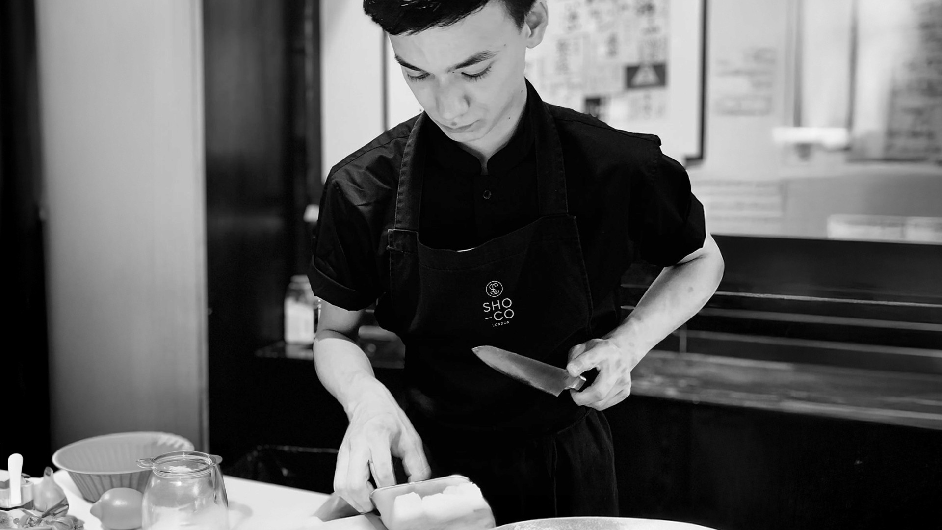
SHO CO London
Refined Dining. Privately Served.

Disciplines
Brand Identity
Logo Design
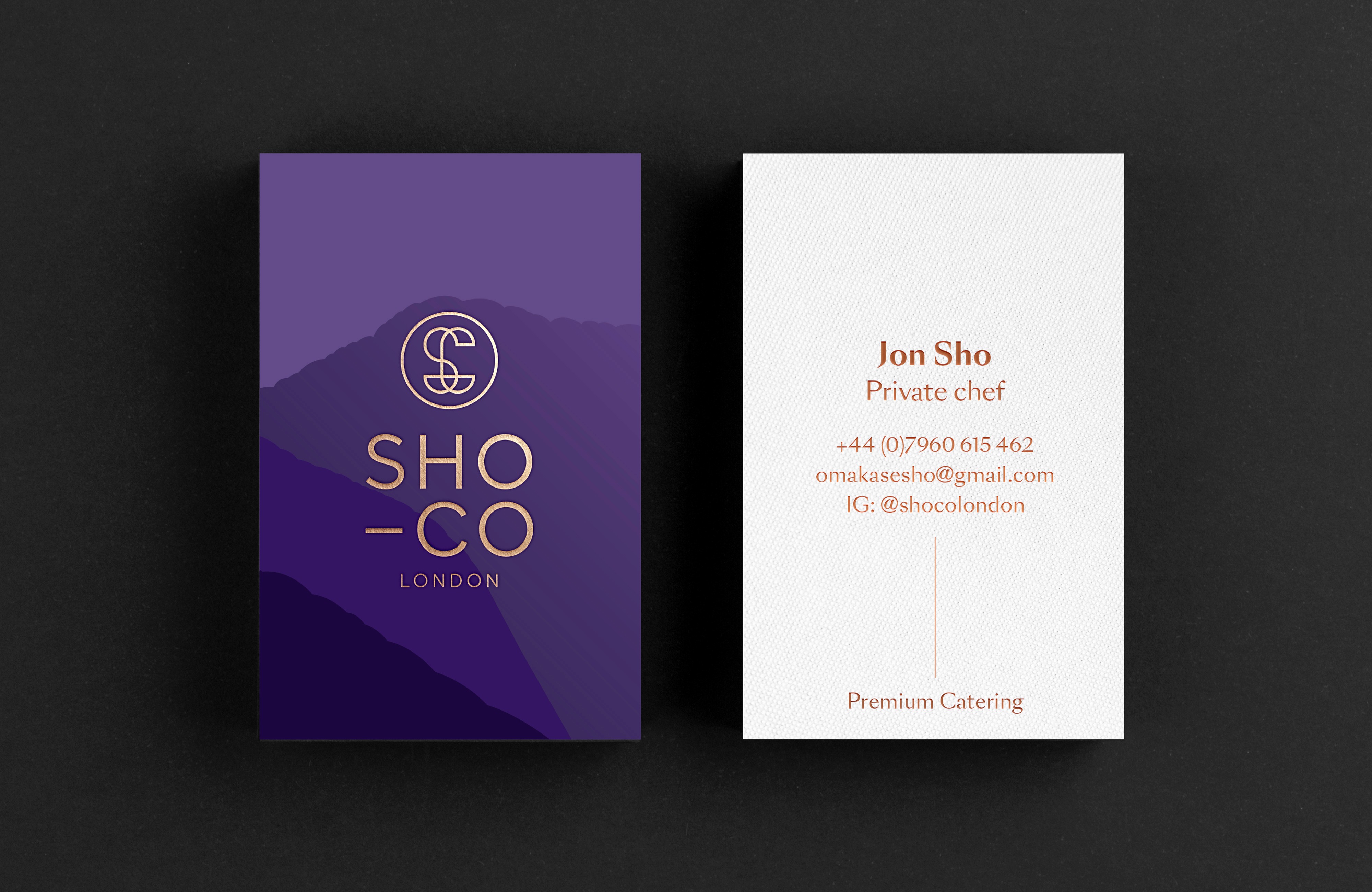
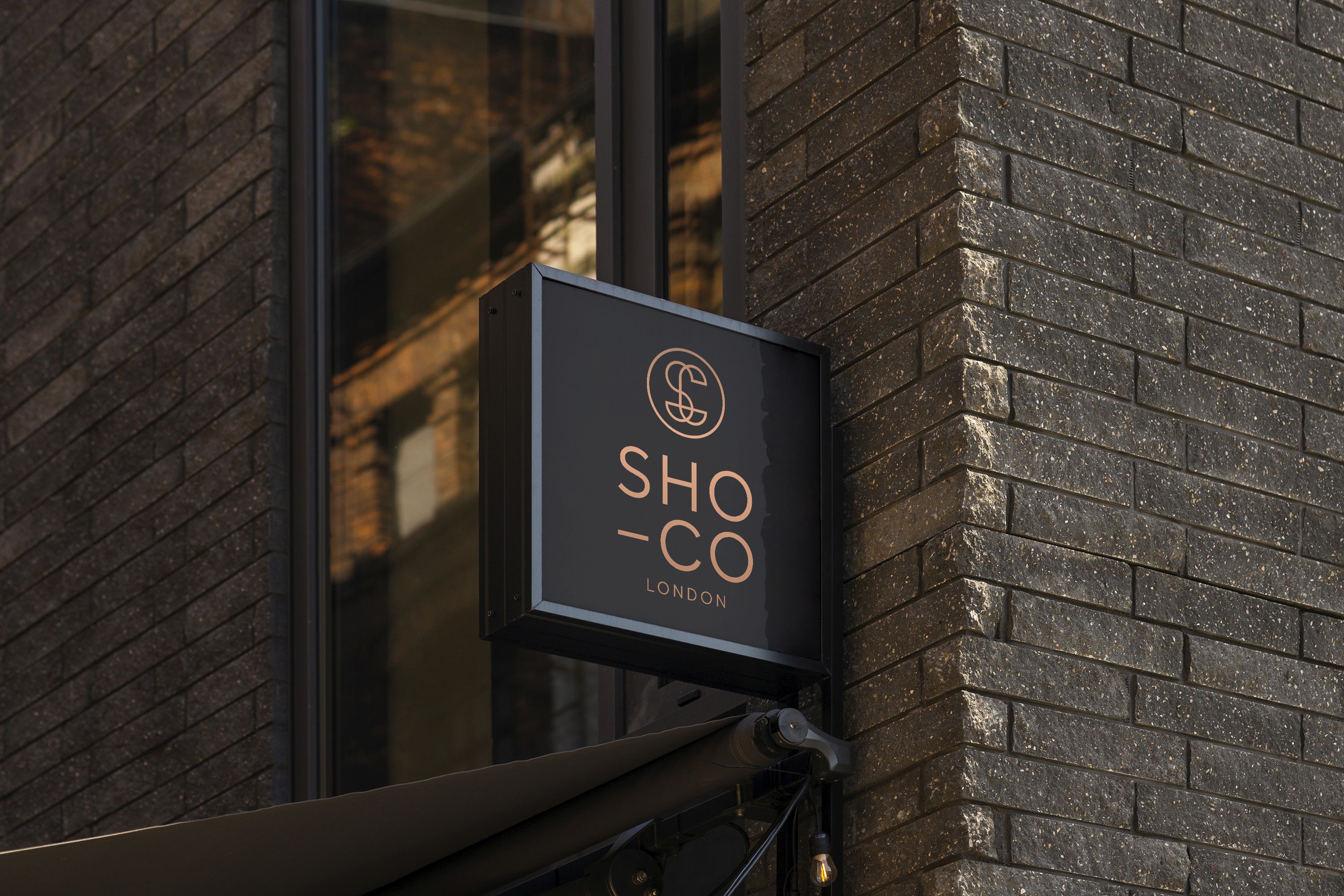
The brief was to create a logo that felt understated, elegant, and confident reflecting the refined nature of Chef Jon Sho’s private dining experience and the discerning clientele he serves. With a background in London’s fine Japanese dining scene, the identity needed to balance precision, restraint and cultural influence.
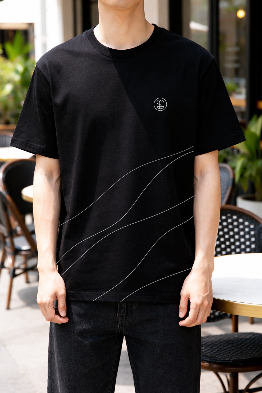
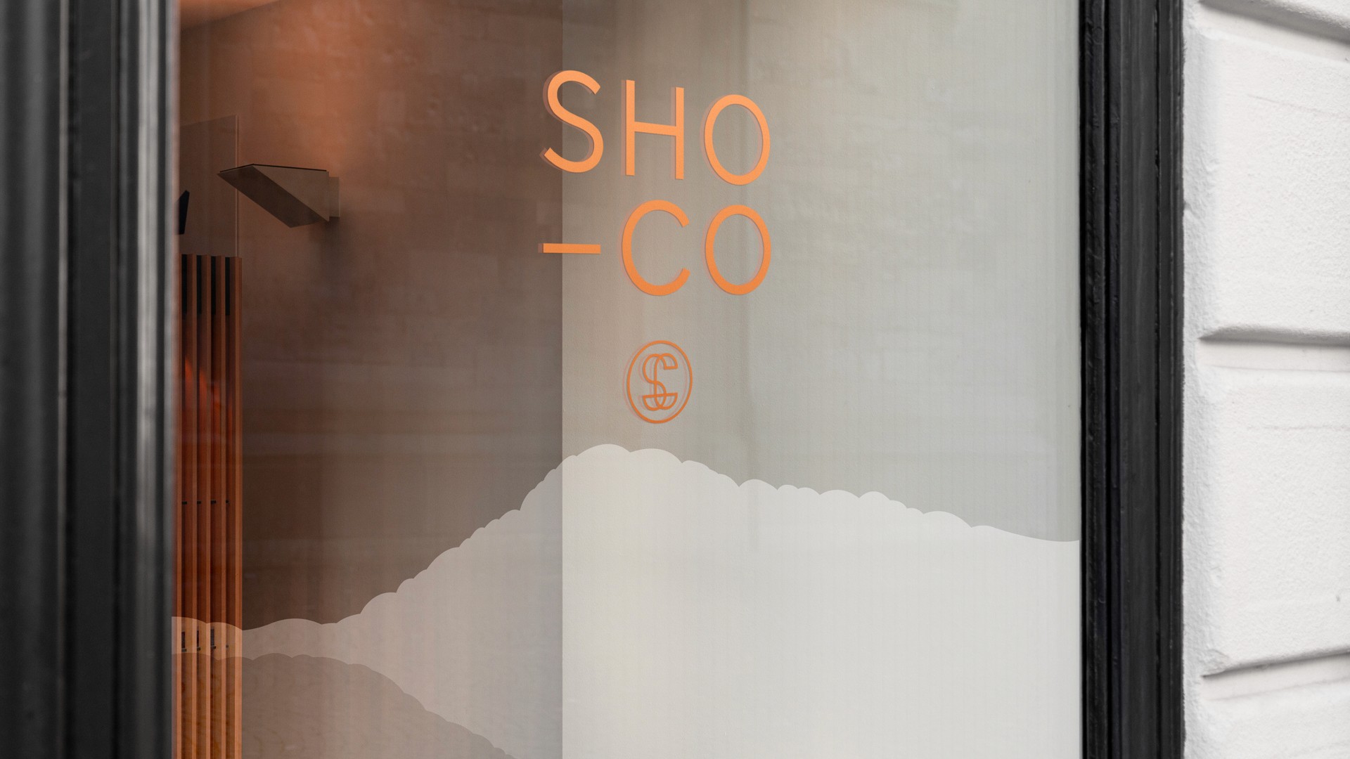
The logo was designed as a minimal, elegant mark, combining the letterforms 'S' and 'C' into a clean, confident symbol. Subtle references to Japanese mountain forms were integrated into the brand language, drawing on Jon’s heritage and the values associated with Japanese design: precision, balance and restraint.
The resulting identity feels modern and premium, bridging high-end catering with performance and discipline designed to resonate with elite clients who value both excellence and intention.


Disciplines
Brand Identity
Logo Design
The brief was to create a logo that felt understated, elegant, and confident reflecting the refined nature of Chef Jon Sho’s private dining experience and the discerning clientele he serves. With a background in London’s fine Japanese dining scene, the identity needed to balance precision, restraint and cultural influence.
The logo was designed as a minimal, elegant mark, combining the letterforms 'S' and 'C' into a clean, confident symbol. Subtle references to Japanese mountain forms were integrated into the brand language, drawing on Jon’s heritage and the values associated with Japanese design: precision, balance and restraint.
The resulting identity feels modern and premium, bridging high-end catering with performance and discipline designed to resonate with elite clients who value both excellence and intention.
Year
2025
Disciplines
Brand Identity
Brand Guidelines
Art Direction
Logo Design
Web Development
Web Design
Marketing Assets
The brief was to create a logo that felt understated, elegant, and confident reflecting the refined nature of Chef Jon Sho’s private dining experience and the discerning clientele he serves. With a background in London’s fine Japanese dining scene, the identity needed to balance precision, restraint and cultural influence.
The logo was designed as a minimal, elegant mark, combining the letterforms 'S' and 'C' into a clean, confident symbol. Subtle references to Japanese mountain forms were integrated into the brand language, drawing on Jon’s heritage and the values associated with Japanese design: precision, balance and restraint.
The resulting identity feels modern and premium, bridging high-end catering with performance and discipline designed to resonate with elite clients who value both excellence and intention.