Disciplines
Brand Identity
Logo Design
Dame Kelly Holmes is a Double Gold Olympic Champion whose brand delivers products, services and experiences designed to inspire and support health, fitness, wellbeing and sport.
The brief was to create a logo that honoured her extraordinary sporting legacy while supporting a broad and evolving brand ecosystem from speaking and mentoring to wellbeing initiatives and commercial partnerships.
The Challenge
The Kelly Holmes brand needed a mark that felt credible, timeless and inspirational. It had to resonate with a wide range of audiences while remaining flexible enough to grow with future business ventures.
Crucially, the logo needed to acknowledge Dame Kelly Holmes’ iconic achievements without relying on literal or overt sporting imagery.
The Concept
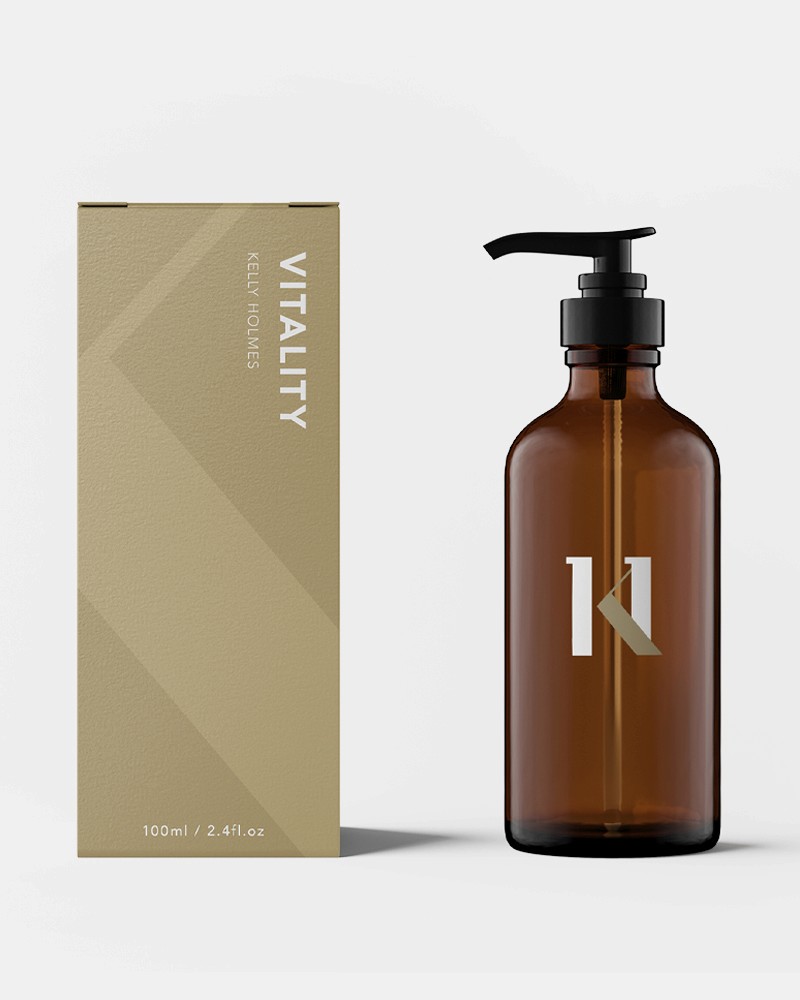
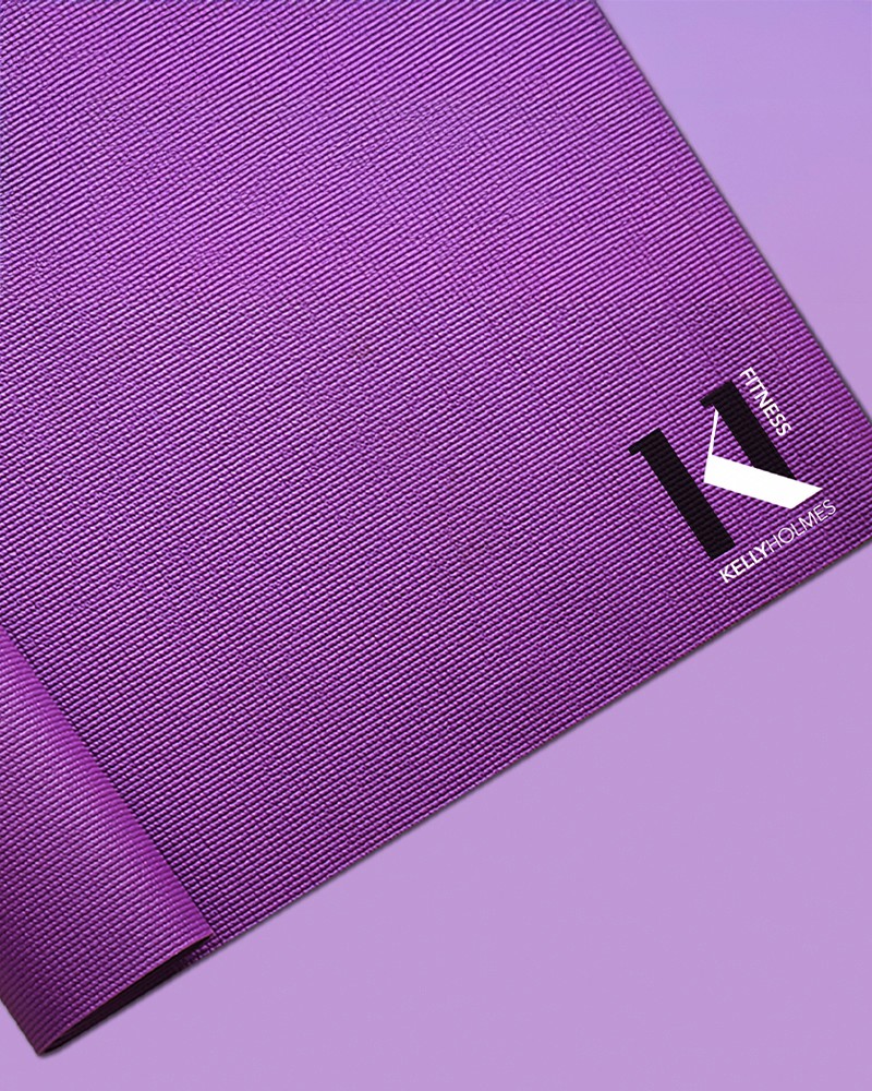
The final logotype is built around the initials K and H, forming a distinctive and confident wordmark. Within the letterforms the two ascenders are carefully designed to represent the number 1 appearing twice.
This subtle detail symbolises Dame Kelly Holmes’ historic achievement of winning two Olympic gold medals, embedding her legacy directly into the identity in a refined and meaningful way.
Rather than shouting the story the logo rewards closer inspection aligning with the brand’s values of integrity, excellence and quiet confidence.
Outcome
The Kelly Holmes logo acts as a marque of quality and inspiration. It reflects both an exceptional sporting legacy and a forward-looking brand built around motivation, wellbeing and positive impact.
The identity provides a strong, adaptable foundation that supports current activities while allowing space for future growth a brand rooted in achievement designed for longevity.


Disciplines
Brand Identity
Logo Design
Dame Kelly Holmes is a Double Gold Olympic Champion whose brand delivers products, services and experiences designed to inspire and support health, fitness, wellbeing and sport.
The brief was to create a logo that honoured her extraordinary sporting legacy while supporting a broad and evolving brand ecosystem from speaking and mentoring to wellbeing initiatives and commercial partnerships.
The Challenge
The Kelly Holmes brand needed a mark that felt credible, timeless and inspirational. It had to resonate with a wide range of audiences while remaining flexible enough to grow with future business ventures.
Crucially, the logo needed to acknowledge Dame Kelly Holmes’ iconic achievements without relying on literal or overt sporting imagery.
The Concept
The final logotype is built around the initials K and H, forming a distinctive and confident wordmark. Within the letterforms the two ascenders are carefully designed to represent the number 1 appearing twice.
This subtle detail symbolises Dame Kelly Holmes’ historic achievement of winning two Olympic gold medals, embedding her legacy directly into the identity in a refined and meaningful way.
Rather than shouting the story the logo rewards closer inspection aligning with the brand’s values of integrity, excellence and quiet confidence.
Outcome
The Kelly Holmes logo acts as a marque of quality and inspiration. It reflects both an exceptional sporting legacy and a forward-looking brand built around motivation, wellbeing and positive impact.
The identity provides a strong, adaptable foundation that supports current activities while allowing space for future growth a brand rooted in achievement designed for longevity.
Year
2025
Disciplines
Web Development
Web Design
E-Commerce
Art Direction
Prototyping
Digital Design Systems
Campaign
Marketing Assets
Dame Kelly Holmes is a Double Gold Olympic Champion whose brand delivers products, services and experiences designed to inspire and support health, fitness, wellbeing and sport.
The brief was to create a logo that honoured her extraordinary sporting legacy while supporting a broad and evolving brand ecosystem from speaking and mentoring to wellbeing initiatives and commercial partnerships.
The Challenge
The Kelly Holmes brand needed a mark that felt credible, timeless and inspirational. It had to resonate with a wide range of audiences while remaining flexible enough to grow with future business ventures.
Crucially, the logo needed to acknowledge Dame Kelly Holmes’ iconic achievements without relying on literal or overt sporting imagery.
The Concept
The final logotype is built around the initials K and H, forming a distinctive and confident wordmark. Within the letterforms the two ascenders are carefully designed to represent the number 1 appearing twice.
This subtle detail symbolises Dame Kelly Holmes’ historic achievement of winning two Olympic gold medals, embedding her legacy directly into the identity in a refined and meaningful way.
Rather than shouting the story the logo rewards closer inspection aligning with the brand’s values of integrity, excellence and quiet confidence.
Outcome
The Kelly Holmes logo acts as a marque of quality and inspiration. It reflects both an exceptional sporting legacy and a forward-looking brand built around motivation, wellbeing and positive impact.
The identity provides a strong, adaptable foundation that supports current activities while allowing space for future growth a brand rooted in achievement designed for longevity.