AZULE ENERGY
Transition to New Ways of Thinking

Disciplines
Brand Identity
Logo Design
Creative Direction
Azule Energy was formed by combining the assets and workforces of bp and Eni in Angola creating a new standalone integrated energy company.
The challenge was to develop a brand identity that marked a fresh beginning, one that honoured deep technical heritage while signalling innovation, ambition and a commitment to Angola’s low-carbon future.
Challenge
As a newly formed organisation, Azule Energy needed to establish immediate credibility and unity across teams, stakeholders, and the wider market. The identity had to represent scale and expertise while clearly differentiating the company as something new, not simply a joint venture but a forward-looking energy business in its own right.
The brand also needed to reflect the evolving energy landscape, positioning Azule as a company prepared for transition and new ways of thinking.
Concept
The name Azule is derived from the Portuguese word for blue (azul), grounding the brand in its Angolan context while introducing a powerful symbolic foundation.
These attributes speak directly to the revitalisation of Angola’s reservoirs and the ambition to operate with renewed energy and vision.
At a deeper level, blue represents transition — the space between traditional energy and greener solutions. It reflects a period of change that demands new thinking, reinforcing the company’s commitment to supporting Angola on its journey toward a lower-carbon future.
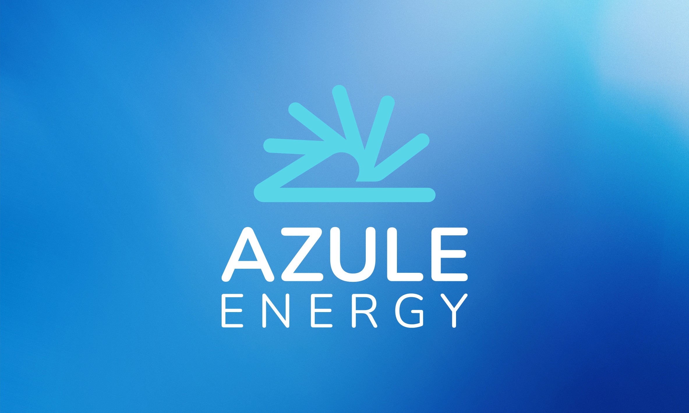
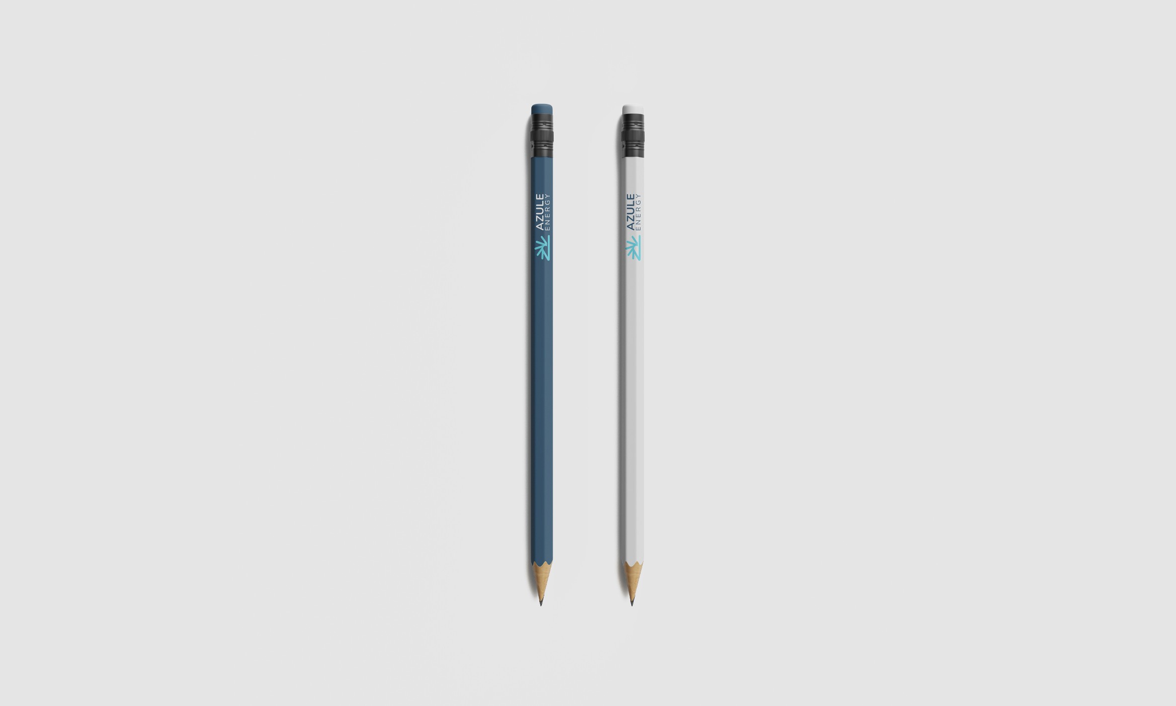
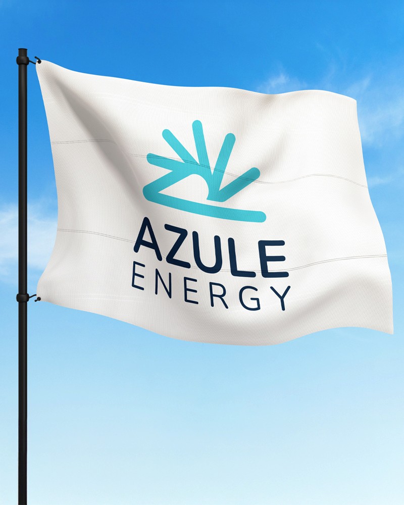
The Logo
The Azule Energy logo symbolises a new horizon for Angola’s energy sector.
The horizon line suggests progress and possibility, a forward-looking perspective grounded in stability. The integrated wave form draws on the company’s deep-water heritage, acknowledging decades of offshore expertise.
The wave also carries layered meaning:
– The power of natural forces
– Human endeavour and collaboration
– Engineering innovation and technology
– The dynamic flow of energy in all its forms
The result is a mark that feels both established and progressive, confident without being aggressive, dynamic without being chaotic.
Outcome
Azule Energy’s identity provides a strong, unified platform for a new standalone company. It captures heritage, scale and ambition while clearly signalling innovation and transition.
The brand positions Azule Energy as a key player in Angola’s energy future rooted in expertise, driven by progress and committed to shaping a more sustainable tomorrow.

Disciplines
Brand Identity
Logo Design
Creative Direction
Azule Energy was formed by combining the assets and workforces of bp and Eni in Angola creating a new standalone integrated energy company.
The challenge was to develop a brand identity that marked a fresh beginning, one that honoured deep technical heritage while signalling innovation, ambition and a commitment to Angola’s low-carbon future.
Challenge
As a newly formed organisation, Azule Energy needed to establish immediate credibility and unity across teams, stakeholders, and the wider market. The identity had to represent scale and expertise while clearly differentiating the company as something new, not simply a joint venture but a forward-looking energy business in its own right.
The brand also needed to reflect the evolving energy landscape, positioning Azule as a company prepared for transition and new ways of thinking.
Concept
The name Azule is derived from the Portuguese word for blue (azul), grounding the brand in its Angolan context while introducing a powerful symbolic foundation.
These attributes speak directly to the revitalisation of Angola’s reservoirs and the ambition to operate with renewed energy and vision.
At a deeper level, blue represents transition — the space between traditional energy and greener solutions. It reflects a period of change that demands new thinking, reinforcing the company’s commitment to supporting Angola on its journey toward a lower-carbon future.
The Logo
The Azule Energy logo symbolises a new horizon for Angola’s energy sector.
The horizon line suggests progress and possibility, a forward-looking perspective grounded in stability. The integrated wave form draws on the company’s deep-water heritage, acknowledging decades of offshore expertise.
The wave also carries layered meaning:
– The power of natural forces
– Human endeavour and collaboration
– Engineering innovation and technology
– The dynamic flow of energy in all its forms
The result is a mark that feels both established and progressive, confident without being aggressive, dynamic without being chaotic.
Outcome
Azule Energy’s identity provides a strong, unified platform for a new standalone company. It captures heritage, scale and ambition while clearly signalling innovation and transition.
The brand positions Azule Energy as a key player in Angola’s energy future rooted in expertise, driven by progress and committed to shaping a more sustainable tomorrow.