
Disciplines
Brand Identity
Logo Design
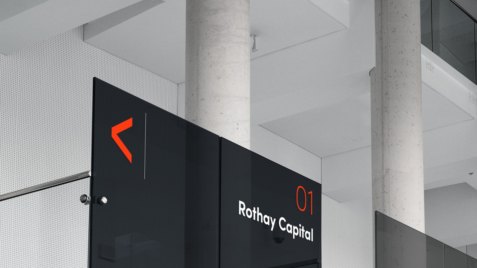
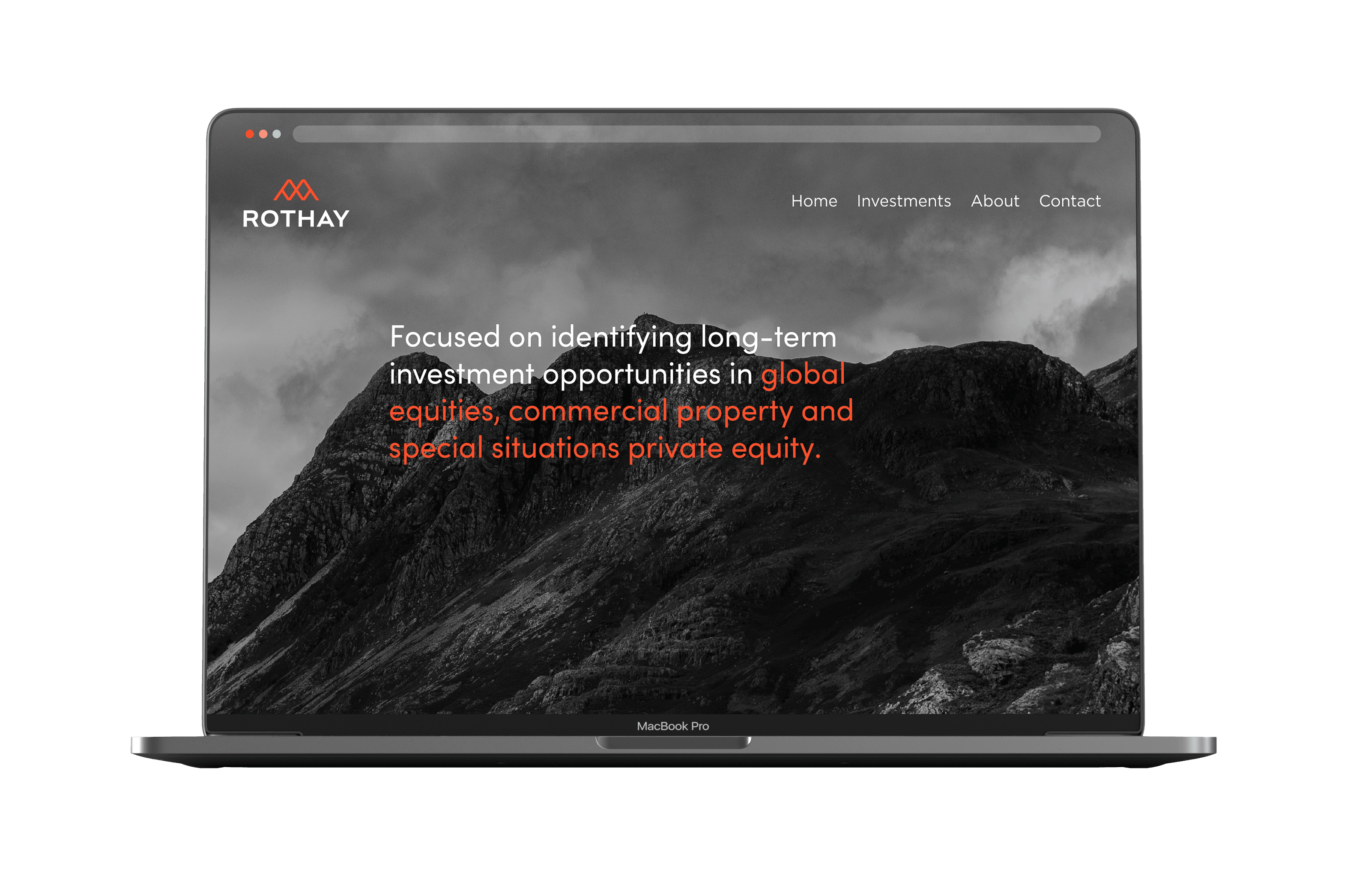
Rothay Capital is an investment firm focused on identifying long-term opportunities across a range of asset classes, including global equities, commercial property and special situations private equity. The brand needed to reflect a sense of confidence, longevity and considered expertise.
Challenge
Operating across multiple asset classes, Rothay Capital required an identity that felt unified and credible while avoiding overly corporate or generic financial aesthetics. The brand needed to communicate stability and trust with a quieter, more distinctive character.
Approach
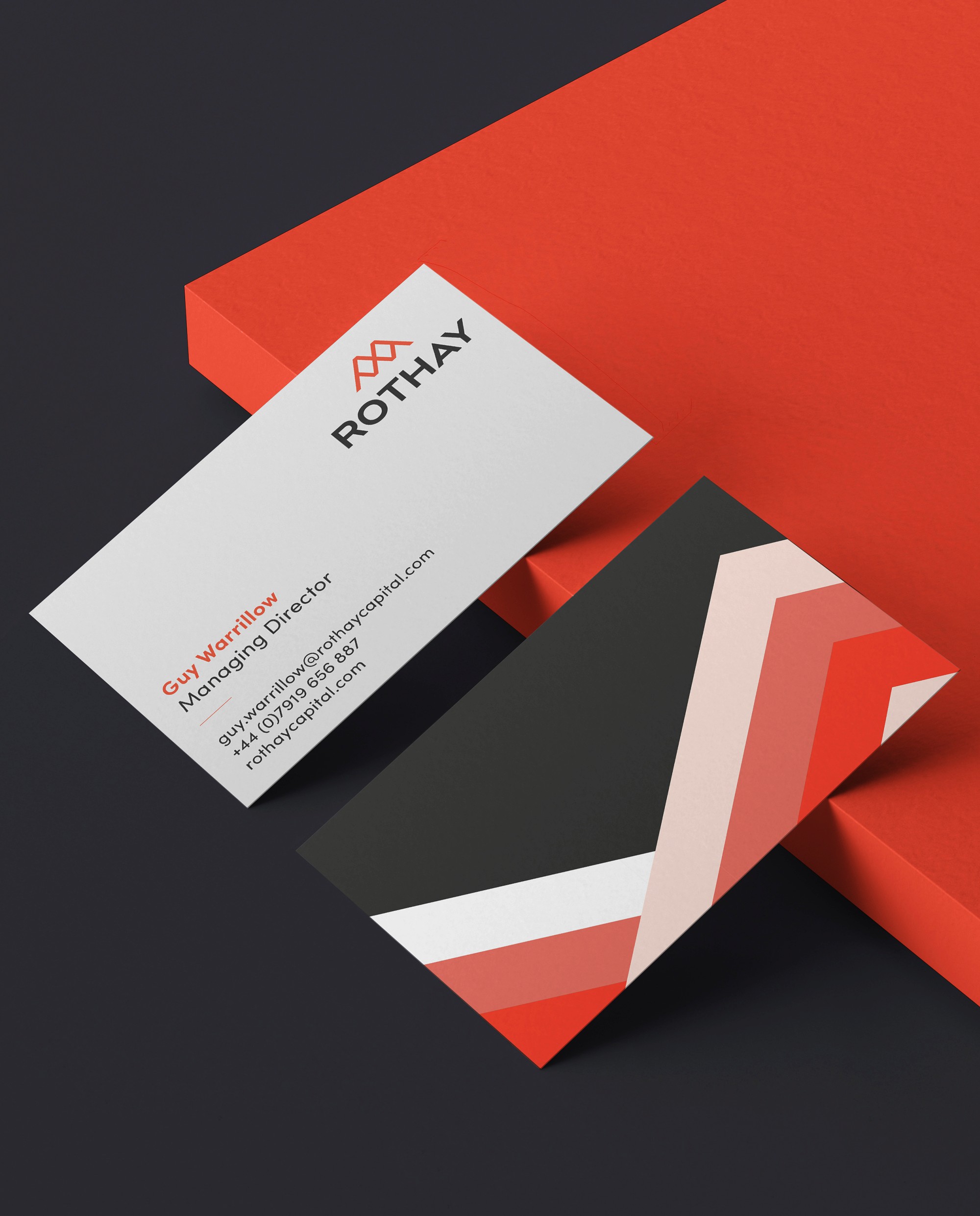
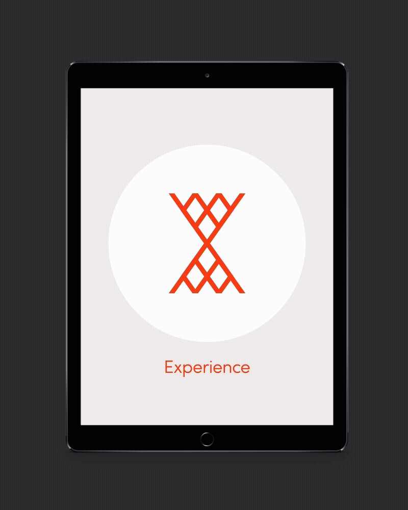
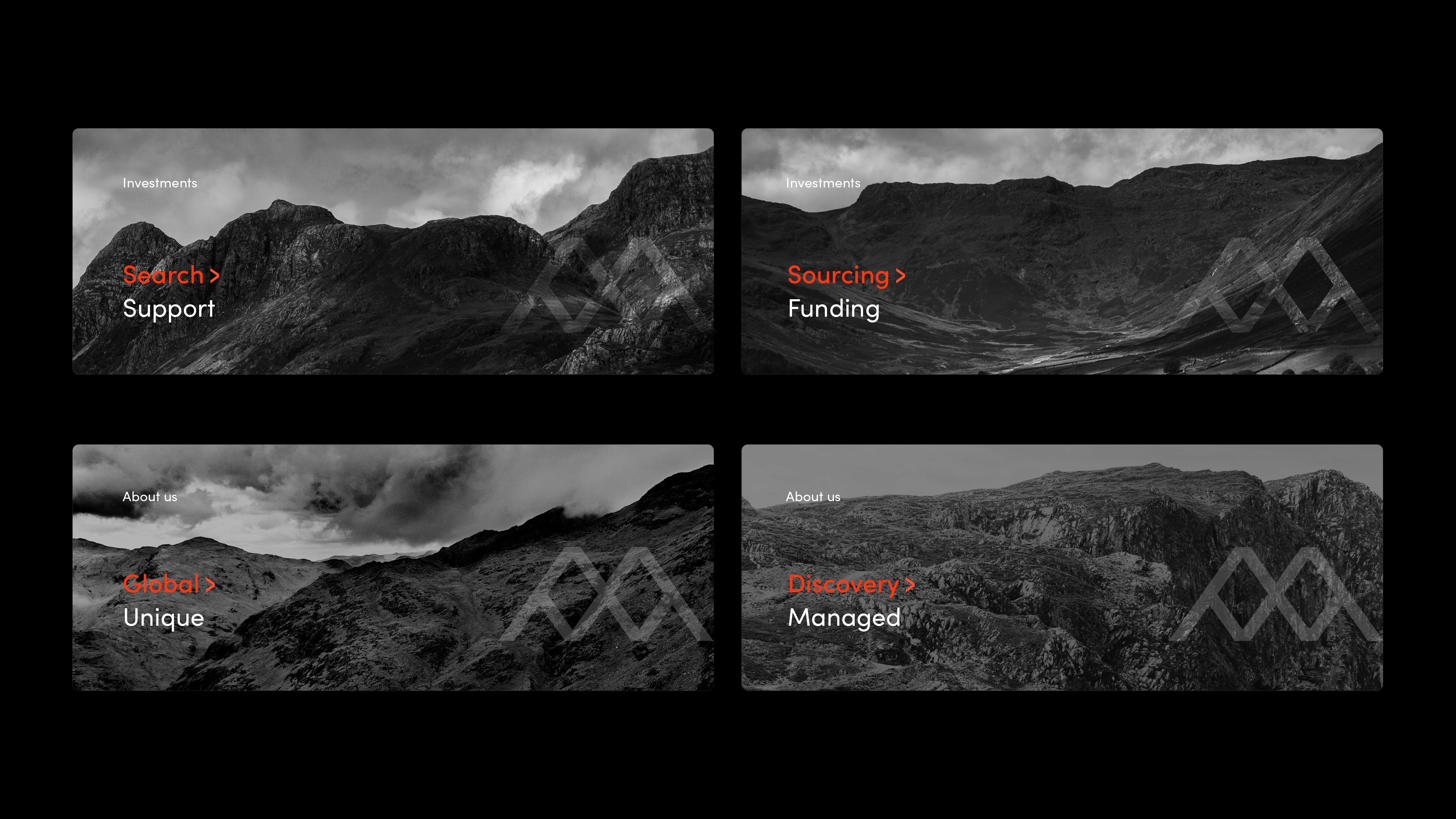
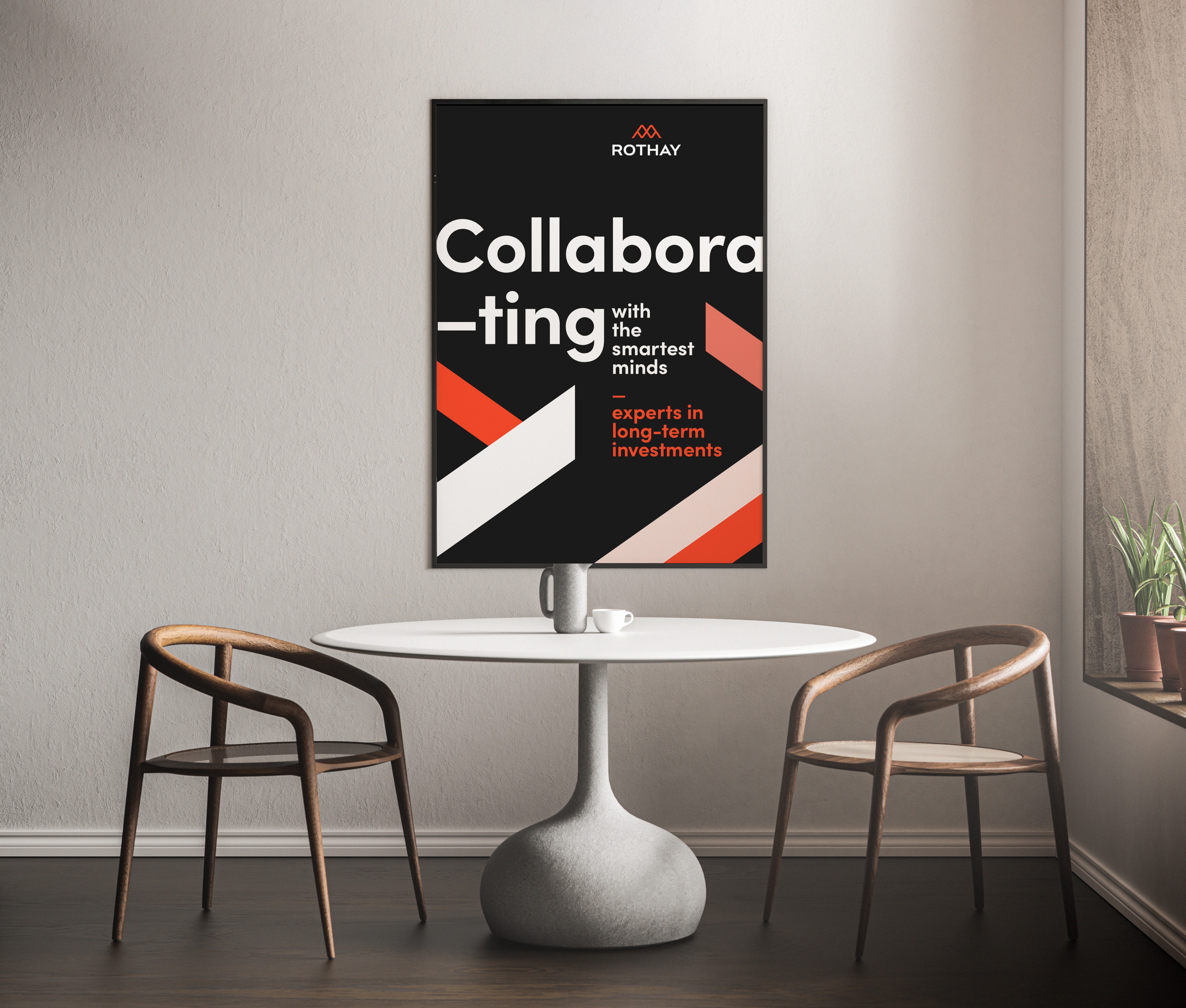
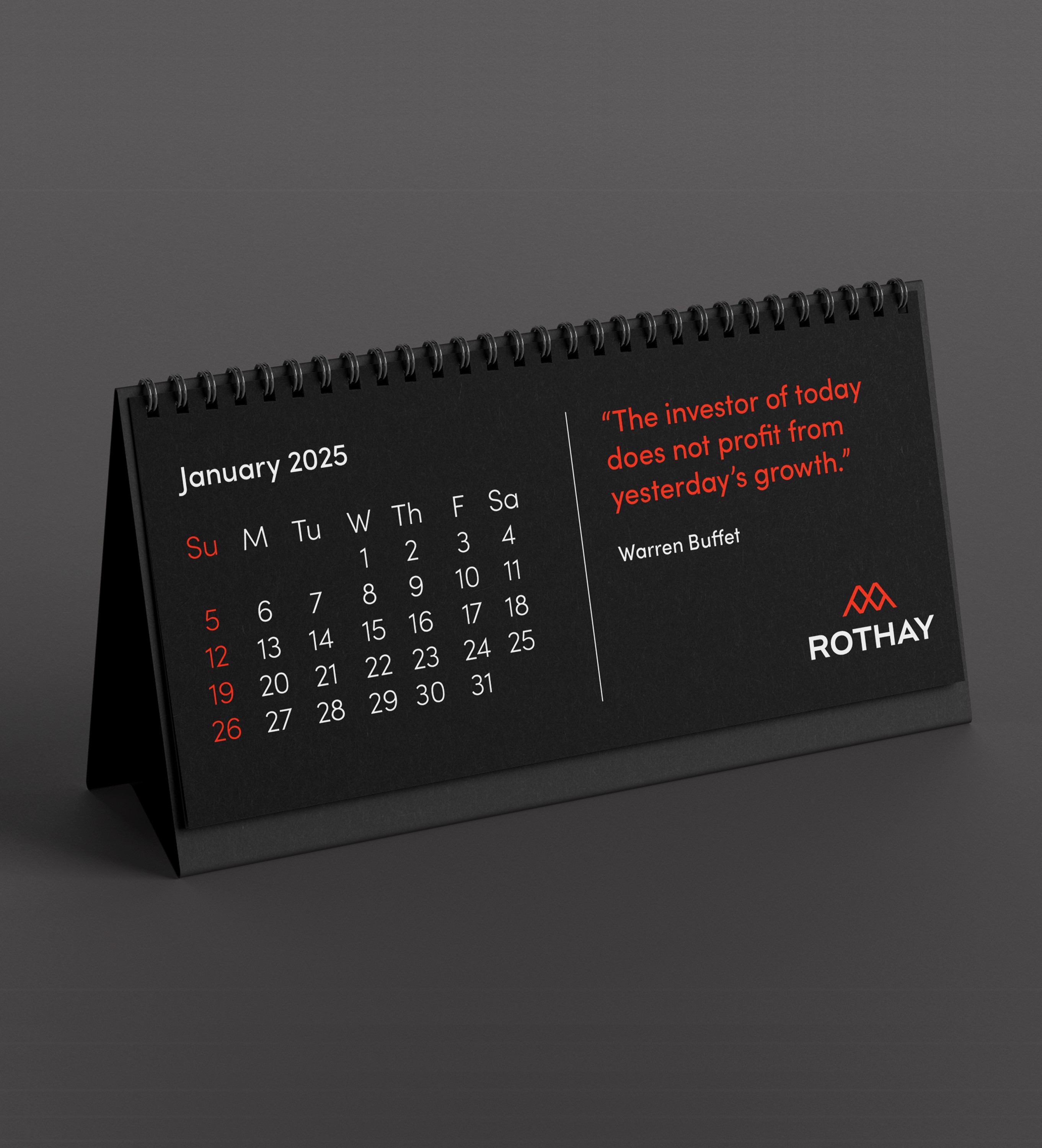
The name Rothay was inspired by a region in the Lake District, known for its natural strength and enduring landscapes. This connection informed the visual direction of the identity. The logo was designed around the form of mountainous terrain, using strong, considered shapes to suggest resilience, perspective and long-term thinking. These elements also reflect the expertise and support Rothay offers its clients steady, informed, and grounded.
Outcome
The resulting identity feels confident and timeless, balancing strength with restraint. Rooted in its natural inspiration, the brand provides a clear and cohesive foundation for Rothay Capital as it continues to grow and invest with a long-term outlook.
Disciplines
Brand Identity
Logo Design
Rothay Capital is an investment firm focused on identifying long-term opportunities across a range of asset classes, including global equities, commercial property and special situations private equity. The brand needed to reflect a sense of confidence, longevity and considered expertise.
Challenge
Operating across multiple asset classes, Rothay Capital required an identity that felt unified and credible while avoiding overly corporate or generic financial aesthetics. The brand needed to communicate stability and trust with a quieter, more distinctive character.
Approach
The name Rothay was inspired by a region in the Lake District, known for its natural strength and enduring landscapes. This connection informed the visual direction of the identity. The logo was designed around the form of mountainous terrain, using strong, considered shapes to suggest resilience, perspective and long-term thinking. These elements also reflect the expertise and support Rothay offers its clients steady, informed, and grounded.
Outcome
The resulting identity feels confident and timeless, balancing strength with restraint. Rooted in its natural inspiration, the brand provides a clear and cohesive foundation for Rothay Capital as it continues to grow and invest with a long-term outlook.
Year
2025
Disciplines
Brand Identity
Logo Design
Web Design
Rothay Capital is an investment firm focused on identifying long-term opportunities across a range of asset classes, including global equities, commercial property and special situations private equity. The brand needed to reflect a sense of confidence, longevity and considered expertise.
Challenge
Operating across multiple asset classes, Rothay Capital required an identity that felt unified and credible while avoiding overly corporate or generic financial aesthetics. The brand needed to communicate stability and trust with a quieter, more distinctive character.
Approach
The name Rothay was inspired by a region in the Lake District, known for its natural strength and enduring landscapes. This connection informed the visual direction of the identity. The logo was designed around the form of mountainous terrain, using strong, considered shapes to suggest resilience, perspective and long-term thinking. These elements also reflect the expertise and support Rothay offers its clients steady, informed, and grounded.
Outcome
The resulting identity feels confident and timeless, balancing strength with restraint. Rooted in its natural inspiration, the brand provides a clear and cohesive foundation for Rothay Capital as it continues to grow and invest with a long-term outlook.


